Golden Orchard is a premium artisanal preserve brand focused on small-batch, all-natural products. The project involved creating a refined visual identity and packaging system that reflects quality, simplicity, and craftsmanship. My role focused on developing a cohesive brand system that scales across multiple flavors while maintaining a consistent and premium aesthetic.
Scalable packaging system across multiple flavors
Refined typography and premium detailing
Distinctive logo mark integrated into wordmark
Project
–
Process
Brand Overview: Golden Orchard
Category: Artisanal preserves (jam, fruit spreads, compotes) Positioning: Premium, small-batch, natural, heritage-inspired Core idea: “Harvested at peak, crafted with care”
Golden Orchard evokes:
orchard-grown fruit
warmth, richness (gold)
tradition + quality craftsmanship
Final Identity System
The design approach centered on balancing heritage and modernity. A serif-based wordmark conveys tradition and quality, while the custom “O” with leaf detailing introduces a distinctive and ownable brand asset tied to the orchard concept.
Gold accents were used strategically to reinforce premium positioning, while a muted, flavor-based color system ensures clarity and scalability across the product range.
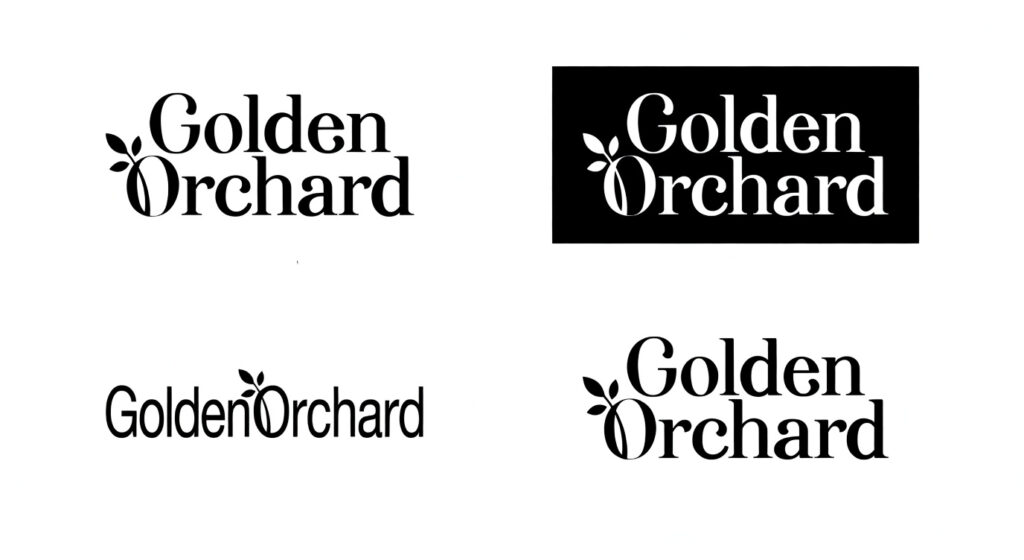
Logo System
The primary logo uses an elegant serif wordmark that conveys heritage, permanence, and sophistication.
A monogram derived from the initials serves as a secondary mark — functioning as a subtle seal across packaging and brand touchpoints.
This hierarchy allows the brand to remain recognizable while maintaining a restrained and premium visual language.
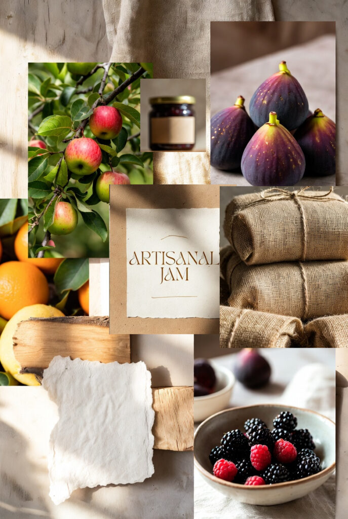
Moodboard
The moodboard draws inspiration from natural materials, orchard environments, and premium food branding, informing a visual direction that is warm, refined, and minimal.
Logo Exploration
Early logo explorations focused on balancing elegance with recognizability, leading to a refined serif wordmark and a distinctive leaf-inspired logo mark.
These were ultimately refined toward a structured serif system that better expressed the brand’s timeless luxury positioning.
Colour Palette
A restrained palette of black, warm white, and gold establishes a premium foundation, while muted accent colors provide flavor differentiation across the product range.
Typography System
Typography plays a central role in the brand’s visual expression.
A high-contrast serif typeface provides elegance and editorial sophistication, while a secondary sans-serif typeface ensures clarity in supporting communication.
This balance reflects the brand’s philosophy: tradition combined with modern discipline.
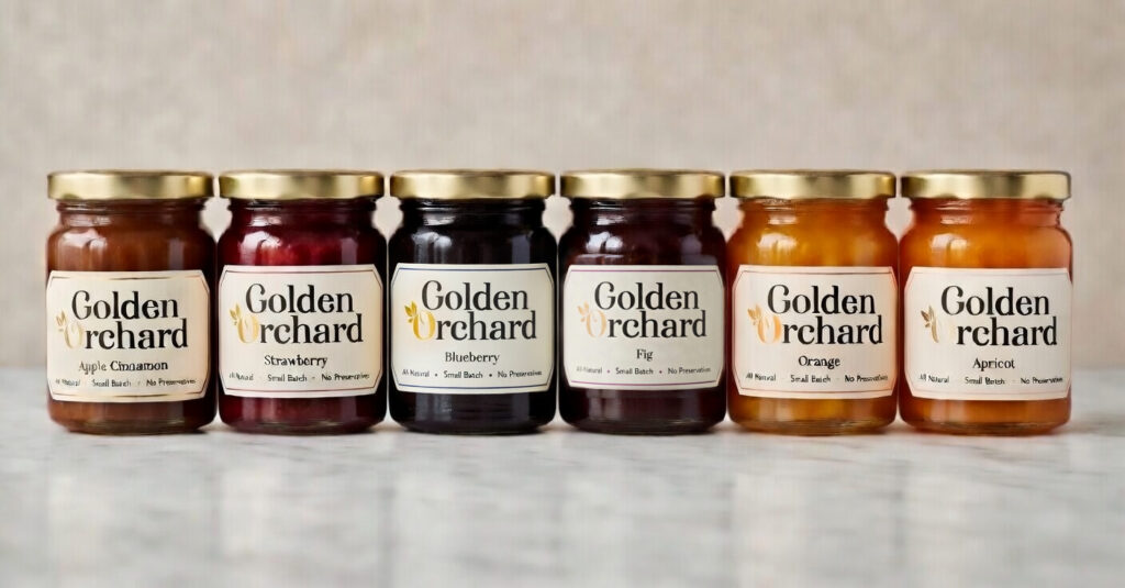
Packaging & Brand Applications
The packaging system applies the logo, wordmark, and gold accents consistently across jars, lids, and labels. Flavour differentiation uses subtle color cues, creating a cohesive and premium identity that scales across products and touchpoints.
Label
Refined typography with premium detailing
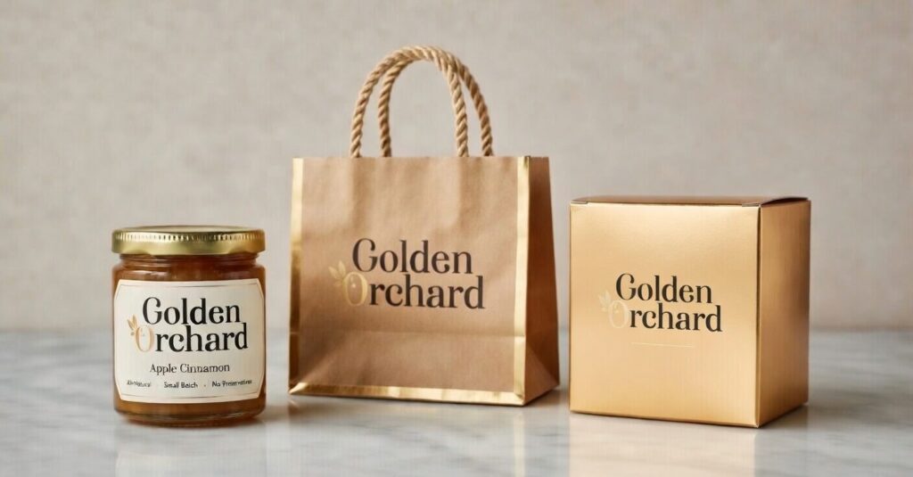
Packaging
The brand system unifies jars, labels, lids, tote bags, and boxes through a consistent use of black, off-white, and gold. Each element—typography, logo mark, and layout—works together to create a cohesive, premium identity. Subtle accents differentiate flavors while maintaining an overall refined and sophisticated aesthetic, reinforcing the brand’s artisanal, high-end positioning across all touchpoints.
Live as if you were to die tomorrow. Learn as if you were to live forever.