Studio Bayah is a contemporary luxury scarf brand positioned within the timeless luxury market.
The objective was to create a visual identity rooted in restraint, permanence, and quiet authority — avoiding trend-driven aesthetics in favor of a system that would remain refined and relevant over time.
The result is a cohesive identity built around disciplined typography, a restrained color palette, and subtle brand applications designed to reinforce an elevated and considered brand experience
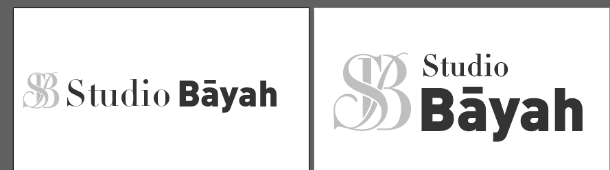
The mark pairs an elegant serif wordmark with a subtle monogram seal, reflecting Studio Bayah’s philosophy of timeless luxury, restraint, and enduring sophistication.
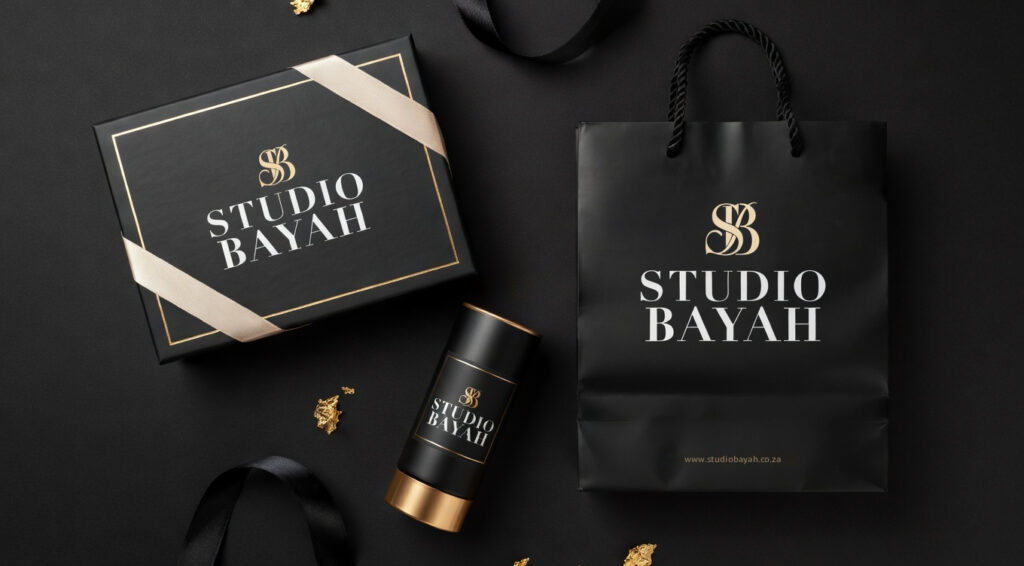
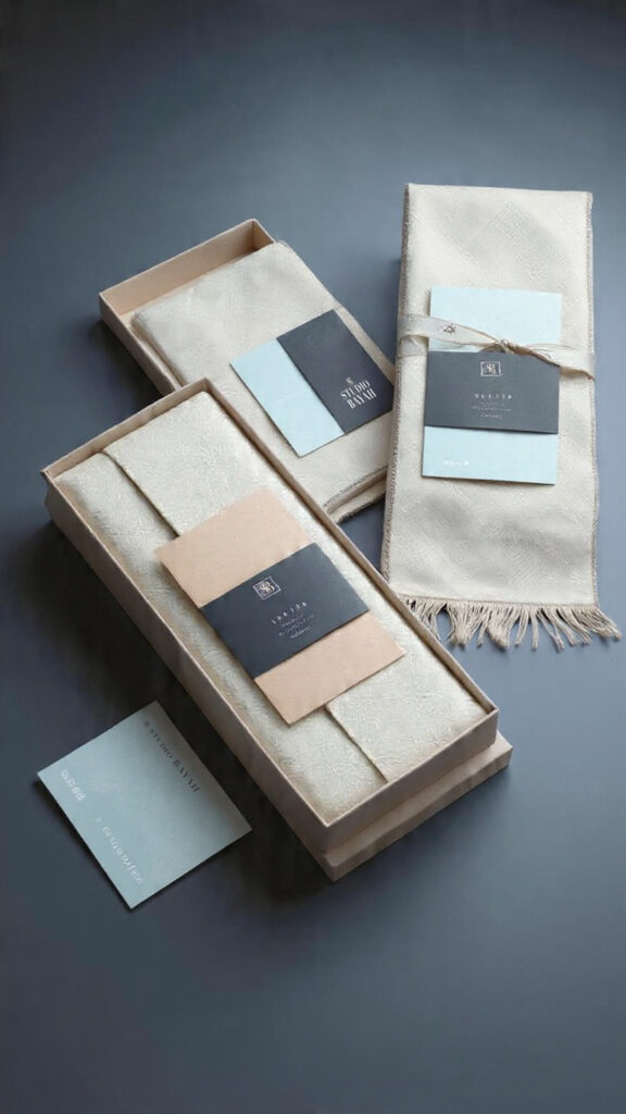
The packaging extends the visual identity through considered applications across the box, scarf presentation, and accompanying thank-you card. The restrained use of the monogram and palette creates a discreet yet refined brand presence within the unboxing experience.
The reel translates the visual identity into motion, bringing together the monogram, typography, and restrained color palette to create a cohesive and refined brand expression. Through pacing, composition, and minimal transitions, the video reinforces the brand’s quiet luxury and considered aesthetic.
Project
–
Process
Brand Positioning
Timeless Composed Refined Intentional
Final Identity System
The Studio Bayah identity is designed to communicate timeless luxury through restraint, clarity, and controlled visual hierarchy.
Rather than relying on decorative elements or seasonal trends, the system emphasizes typography, proportion, and subtle brand repetition to create a refined and enduring brand presence.
Logo System
The primary logo uses an elegant serif wordmark that conveys heritage, permanence, and sophistication.
A monogram derived from the initials serves as a secondary mark — functioning as a subtle seal across packaging and brand touchpoints.
This hierarchy allows the brand to remain recognizable while maintaining a restrained and premium visual language.
Moodboard
The Studio Bayah moodboard exudes timeless luxury through a palette of beige, light, and dark tones, paired with iconic brands like Chanel, Louis Vuitton, and Dior. It features aspirational lifestyle elements — handbags, watches, luxury clothing, and pointed-toe stilettos — complemented by elegant serif typography. The overall feel is sophisticated, refined, and unmistakably high-end.
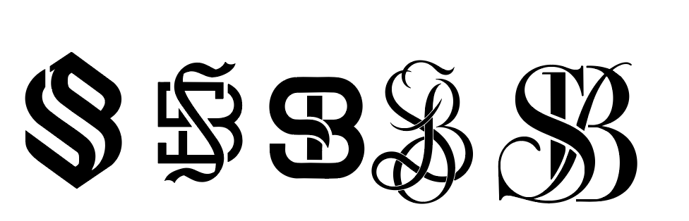
Logo Exploration
Initial explorations considered multiple typographic approaches, including minimal modern sans-serif marks and more ornamental monogram directions.
These were ultimately refined toward a structured serif system that better expressed the brand’s timeless luxury positioning.
Colour Palette
The palette was intentionally limited to neutral tones that support longevity and versatility.
Warm ivory and muted beige tones create a soft luxury base, while charcoal provides contrast and authority.
This restrained palette ensures the identity remains timeless rather than trend-driven.
Typography System
Typography plays a central role in the brand’s visual expression.
A high-contrast serif typeface provides elegance and editorial sophistication, while a secondary sans-serif typeface ensures clarity in supporting communication.
This balance reflects the brand’s philosophy: tradition combined with modern discipline.
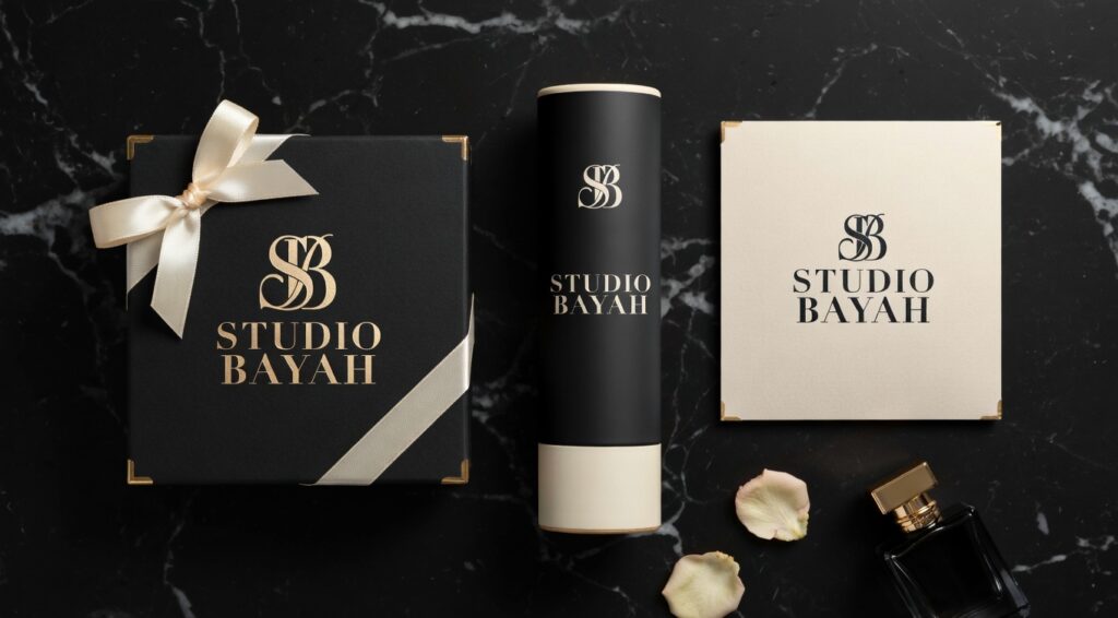
Packaging & Brand Applications
The packaging system was designed to reinforce the brand’s quiet luxury positioning through subtle detail and material consideration.
Each element contributes to a cohesive brand experience that feels intentional and refined rather than promotional.
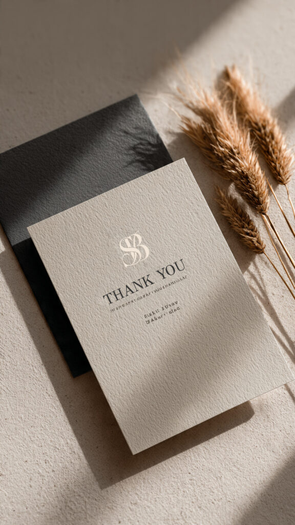
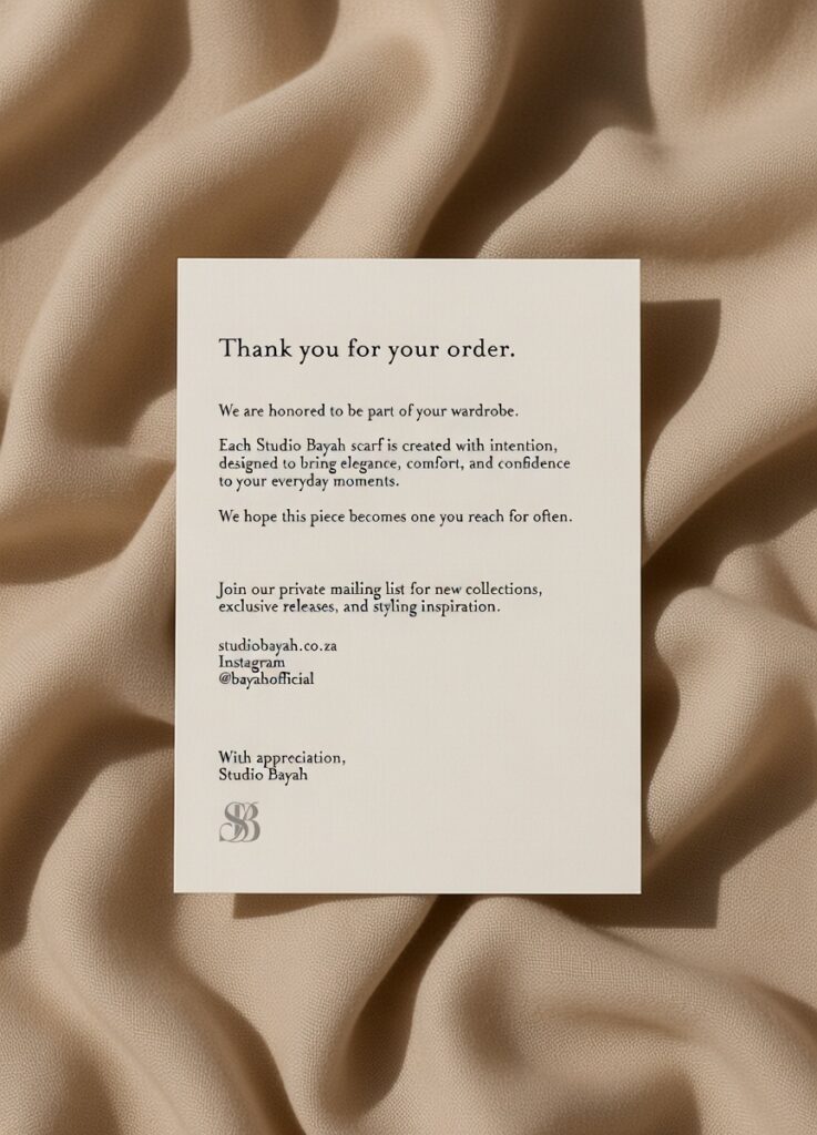
Thank You Card
Printed on uncoated stock with generous margins, the card reflects the brand’s emphasis on restraint and clarity.
The front features the monogram as a quiet signature, while the reverse introduces the brand’s digital touchpoints in a controlled and minimal format.
Packaging
Packaging acts as a tangible extension of the brand’s identity.
The box design incorporates restrained typography, the monogram, and a carefully controlled color palette to create a presentation that feels refined and intentional. The subtle use of brand elements allows the product to remain the focal point while reinforcing the brand’s quiet luxury.
This approach reflects the brand’s philosophy: timeless elegance expressed through restraint.
Live as if you were to die tomorrow. Learn as if you were to live forever.