Zodone is an outdoor adventure lifestyle brand positioned at the intersection of performance and modern minimalism. The visual identity emphasizes clarity, strength, and adaptability through clean geometry, a disciplined black-and-white palette, and subtle branding systems. The result is a cohesive identity that balances refined functionality with premium aesthetics.
Minimal, premium, logo, texture, detail
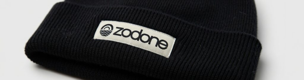
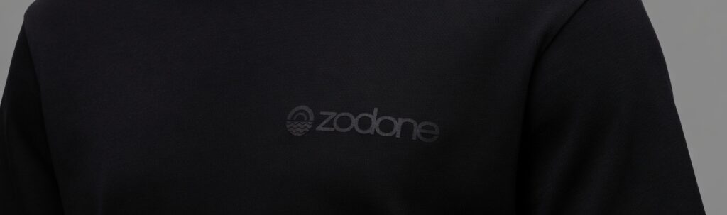
Apparel, system, black, off-white, clean
Lifestyle, outdoor, minimal, premium, editorial
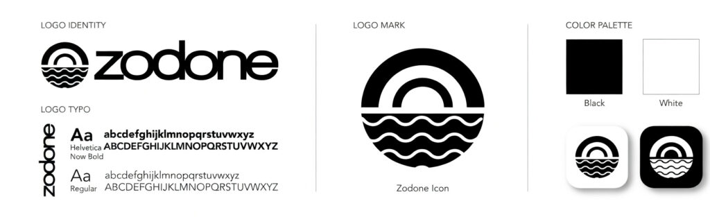
Final Identity System
ZODONE is a minimal outdoor apparel brand built for urban explorers who move between city and nature.
The identity is designed around transition and balance—capturing the shift between structured environments and organic landscapes.
Audience: Design-conscious, outdoor-curious city dwellers
Positioning: Premium, minimal alternative to loud outdoor brands
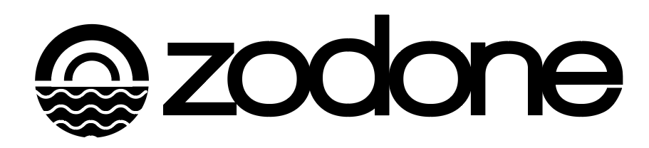
Concept:Horizon as a symbol of transition
A System Built on the Horizon
Content:
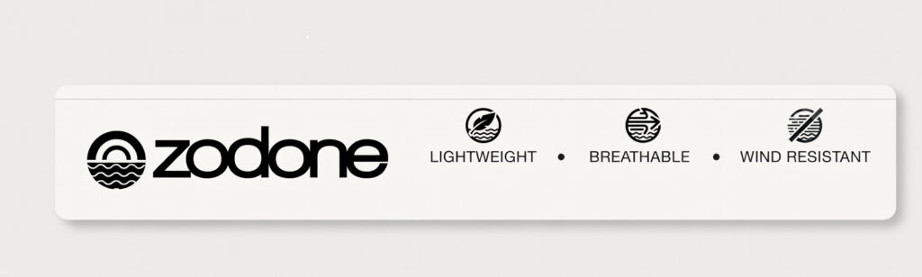
The circle = world / environment
The horizontal lines = horizon / movement / balance
The repetition = rhythm of travel
Moodboard
Typography
Typography balances clarity with subtle character to reflect the brand’s restrained personality.
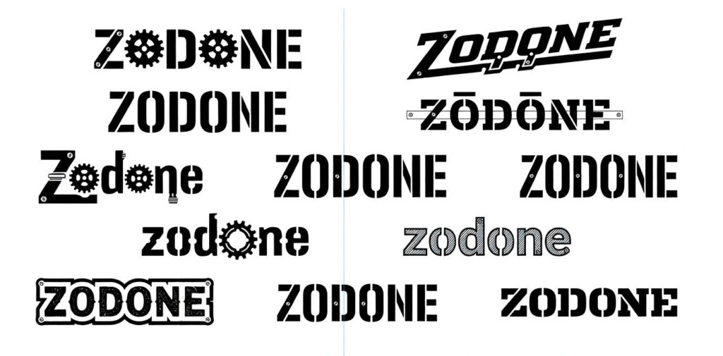
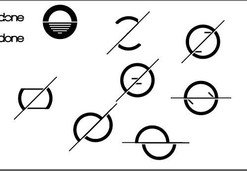
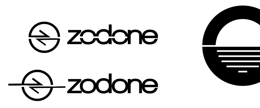
Logo Exploration
Exploring multiple directions allowed the strongest concept to emerge through iteration and refinement.
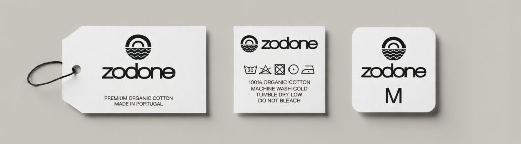
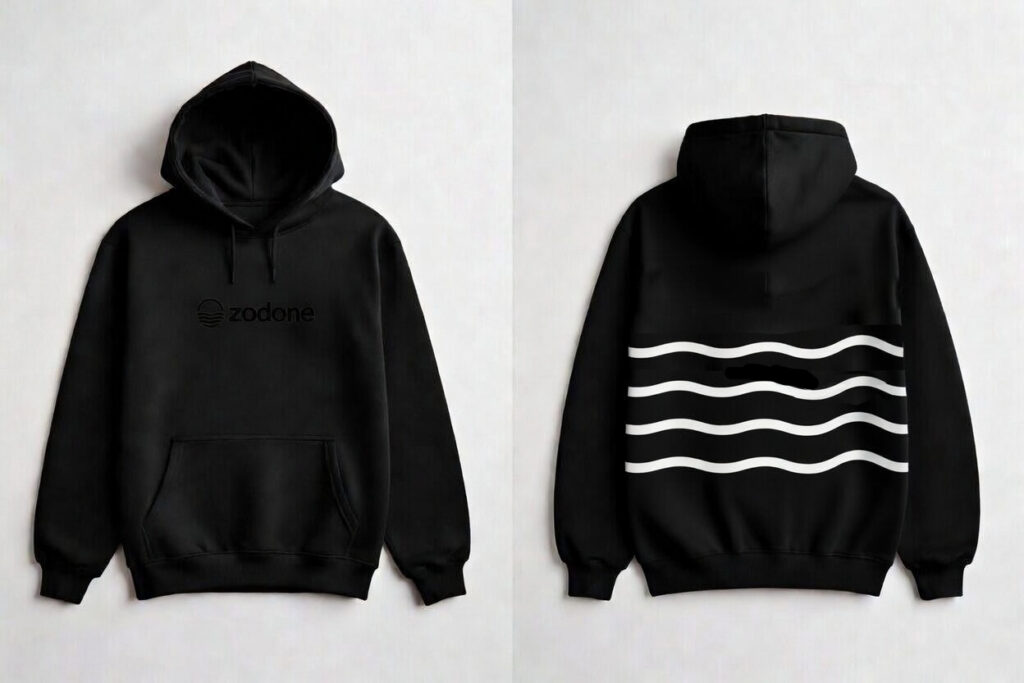
Packaging & Brand Applications
Icon + Pattern System
Live as if you were to die tomorrow. Learn as if you were to live forever.